[0.1.2] Coat of Polish
This update comes with a number of significant improvements to the game’s usability. The UI is also much more readable now. It should be much easier to figure out what is happening in the game, like which enemy is attacking where. There are also a host of other small tweaks and fixes.
Usability Improvements

Some of the UI and UX has been a bit rough for a while, so we’ve done a pass on this and made a number of improvements. It should (hopefully) be much easier to play the game now.
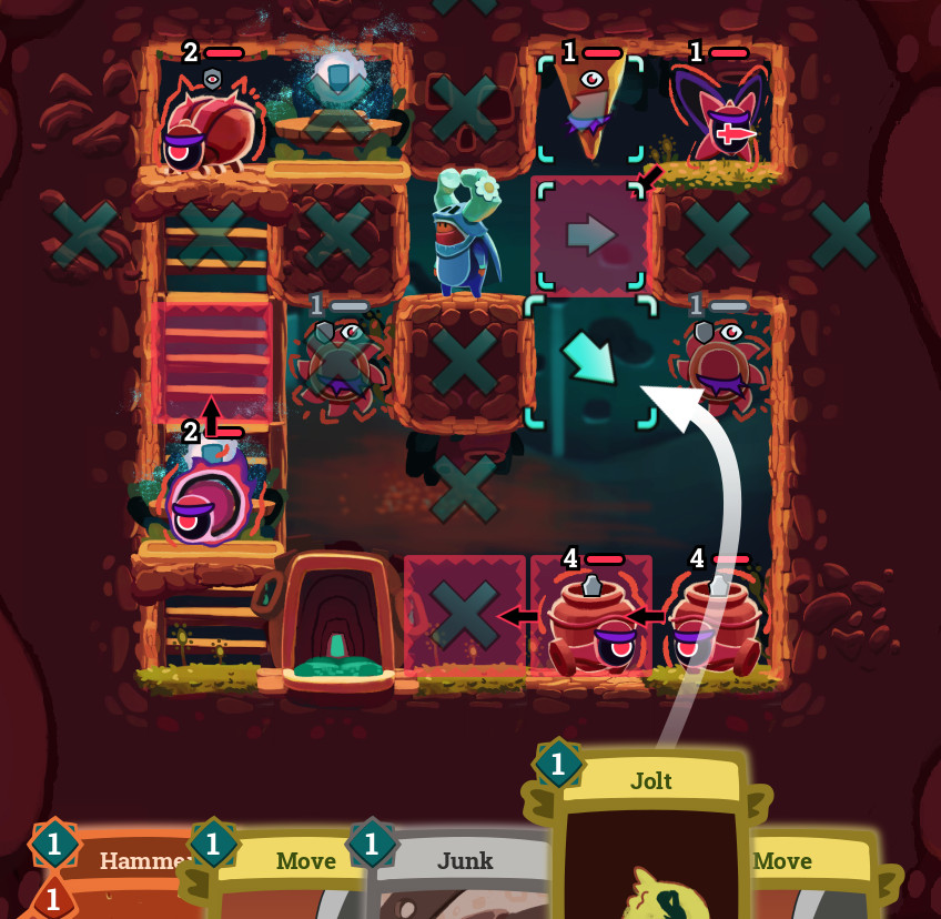
One of the most noticeable changes is that instead of literally dragging a card onto the grid, when you start dragging now, an arrow appears and makes it very clear where the card will go, without obscuring the play area. And when you do play a card, it won’t obscure the play area.
A major complaint we’ve been receiving is that it is difficult to see what enemies are planning to do. Which enemy is attacking that cell? Well now it should be much easier! We’ve done a comprehensive pass on the visuals to make them much clearer, the arrows for moves/attacks are now animated, and when you hover over enemies or their targets, it’ll highlight just the relevant enemies. Also, if you’re unsure of the order enemies will perform their actions, there is a turn order button in the top right you can hover over to show numbers on the enemies for their order. The enemies also have dynamic eyes that indicate some of their intentions. This should all take a lot of the guesswork out of the game!
The health bars and status icons have been overhauled. Shields have been converted to a status effect. Frozen and Shielded statuses are also communicated by tinting the enemies and coloring their health bars, so it should be much easier to interpret. The Boss keyword has also been changed to new Key status with its own icon.
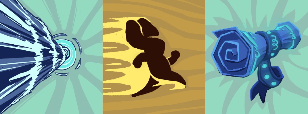
New Card Art
This update includes new art for a bunch of cards, as we slowly but surely flesh out the full compendium. Here’s a taste:

Other Changes
- Mouse health increased from one to two
- Ghost Ceramist has new second shield and is now a boss
- Audio: add lots of sound fx placeholders
- Rename card keyword: Uncopyable -> Clone-proof
- Adjustments to platform tiles and extra variants
- Exit door adjustments and locked variant
- Fix for HTML5 bug with music playing twice or not stopping
- Long credits lines wrap on narrow aspect ratios
- Fix bug with crash if an attack+move caused the player to die (Volatile)
- Fix vertical sizing on game summary if darkness
- Movement from gravity is more gravity-like
- Turn on selection mode by default on desktop
- Tweak Focus description to be clearer
Feedback
Any feedback or advice is appreciated, but for this version we’re especially interested in:
- Do you like the new usability changes? Does it make it easier to play?
- Did you come up with any new fun/interesting combos/strategies?
- General impressions?
Get Enter the Titan
Enter the Titan
Destroy the invading titans from within. Roguelike deckbuilder.
| Status | Prototype |
| Authors | Francois van Niekerk, Clockwork Acorn |
| Genre | Card Game, Puzzle |
| Tags | Deck Building, Procedural Generation, Roguelike, Roguelite, Singleplayer, Tactical, Turn-based, Turn-Based Combat, Turn-based Strategy |
| Languages | English |
More posts
- Open to Everyone!Jan 27, 2024
- [0.1.5] Hear No EvilJan 27, 2024
- [0.1.4] Flying HoverJan 27, 2024
- [0.1.3] Style BumpJan 27, 2024
- [0.1.1] Mysterious Shrines AppearJan 27, 2024
- [0.1.0] Titans ArriveJan 27, 2024
- [0.0.5] Charmed to Meta YouJan 27, 2024
- [0.0.4] Hand of CardsJan 27, 2024
- [0.0.3] Boss BumpingJan 27, 2024
Leave a comment
Log in with itch.io to leave a comment.